ARitize 3D Portal homepage is the dashboard which we can view all available statistics on your model's performance including Device Chart, Views by Category, Top Performing Models and Heat Map.
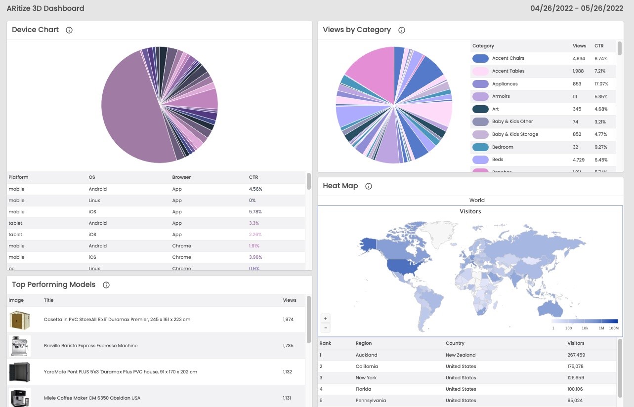
Figure 2. ARitize 3D Dashboard showing different statistics on model’s performance through pie charts, heat map, and tables.
Device Chart
This interactive pie chart illustrates the percentage of views based on the type of device. Click-through rate (CTR) is used as a measurement for views among different platforms, operating systems (OS) and browsers. You can hover through each slice to view numerical proportions of your data by the device type.
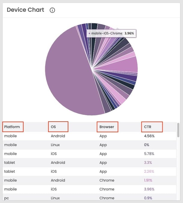
Figure 3. The device chart describing CTR percentages throughout different platforms, operating systems, and browsers.
Views by Category
This interactive pie chart describes the number of views of 3D models and AR (Augmented Reality) experiences based on categories. Views and Click-through rates are used as a measurement on how your models perform. You can hover through each slice to see numerical proportions of your data by category.
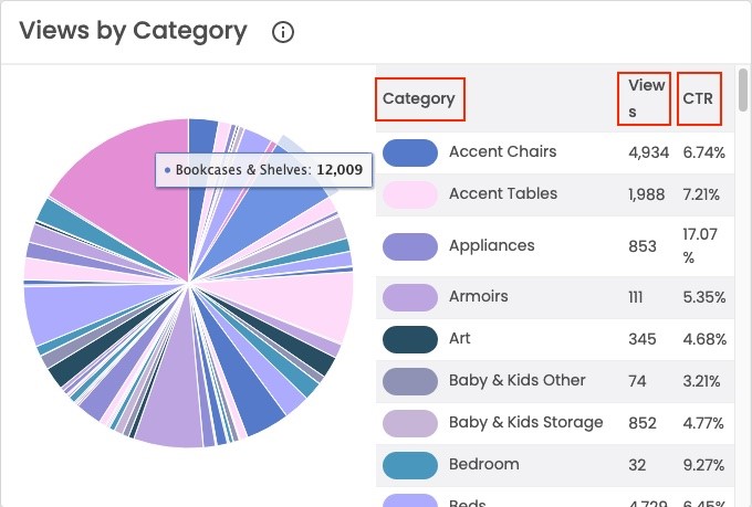
Figure 4. The views by category pie chart and table illustrating the number of views and CTR percentages based on category.
Top Performing Models
This table shows ranking of models with the highest number of views in a descending order.
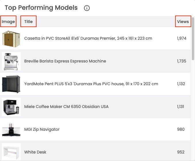
Figure 5. The top performing models table showing the number of views throughout different models in a descending order.
Heat Map
This interactive heat map describes a distribution of visitors for 3D & AR experiences based on location. You can hover through each country to see where your audiences come from.
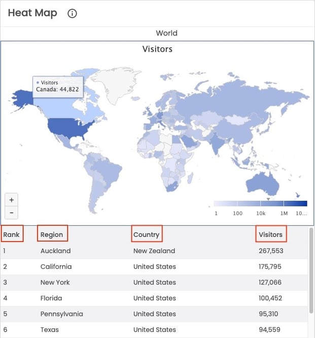
Figure 6. The heat map representing the ranking of visitors based on region and country.